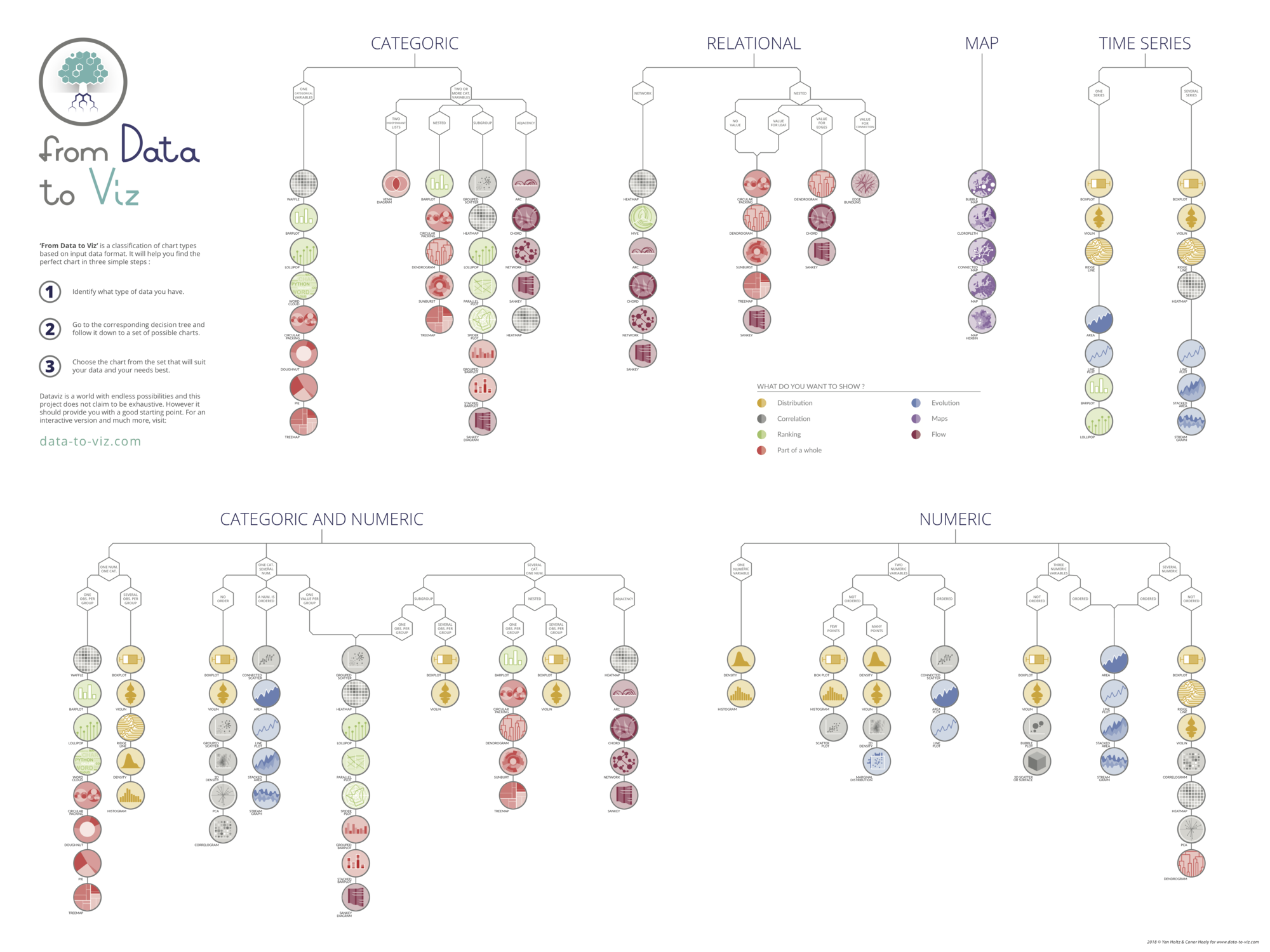
The D3 Graph Gallery helps you build any chart with
Javascript.
However, choosing the most appropriate chart type for
your dataset can be challenging.
My project,
Data To Viz,
addresses this issue. It provides a
decision tree that guides you to the
ideal chart for your data.
If you're interested, I can send you a high-resolution
version of the poster directly to your inbox!
Interactive pie chart with input data selector
This post describes how to build an interactive
pie chart with input data selector with
d3.js. See other pie examples in the
pie chart section of the gallery.
Watch out: pie chart is most of the time a very bad way to
convey information as explained in
this post.
This example works with d3.js v4 and v6
Note: transition could be improved to avoid the current
weird shape distortion. The code would be way more
complicated though, see
here
for an example.
|
<!DOCTYPE html><metacharset="utf-8"><!-- Load d3.js --><scriptsrc="https://d3js.org/d3.v4.js"></script><!-- Color scale --><scriptsrc="https://d3js.org/d3-scale-chromatic.v1.min.js"></script><!-- Add 2 buttons --><buttononclick="update(data1)">Data 1</button><buttononclick="update(data2)">Data 2</button><!-- Create a div where the graph will take place --><divid="my_dataviz"></div>
<!DOCTYPE html><metacharset="utf-8"><!-- Load d3.js --><scriptsrc="https://d3js.org/d3.v6.js"></script><!-- Add 2 buttons --><buttononclick="update(data1)">Data 1</button><buttononclick="update(data2)">Data 2</button><!-- Create a div where the graph will take place --><divid="my_dataviz"></div>
<script>// set the dimensions and margins of the graphvar width =450
height =450
margin =40// The radius of the pieplot is half the width or half the height (smallest one). I subtract a bit of margin.var radius = Math.min(width, height)/2- margin
// append the svg object to the div called 'my_dataviz'var svg = d3.select("#my_dataviz").append("svg").attr("width", width).attr("height", height).append("g").attr("transform","translate("+ width /2+","+ height /2+")");// create 2 data_setvar data1 ={a:9, b:20, c:30, d:8, e:12}var data2 ={a:6, b:16, c:20, d:14, e:19, f:12}// set the color scalevar color = d3.scaleOrdinal().domain(["a","b","c","d","e","f"]).range(d3.schemeDark2);// A function that create / update the plot for a given variable:functionupdate(data){// Compute the position of each group on the pie:var pie = d3.pie().value(function(d){return d.value;}).sort(function(a, b){ console.log(a);return d3.ascending(a.key, b.key);})// This make sure that group order remains the same in the pie chartvar data_ready =pie(d3.entries(data))// map to datavar u = svg.selectAll("path").data(data_ready)// Build the pie chart: Basically, each part of the pie is a path that we build using the arc function.
u
.enter().append('path').merge(u).transition().duration(1000).attr('d', d3.arc().innerRadius(0).outerRadius(radius)).attr('fill',function(d){return(color(d.data.key))}).attr("stroke","white").style("stroke-width","2px").style("opacity",1)// remove the group that is not present anymore
u
.exit().remove()}// Initialize the plot with the first datasetupdate(data1)</script>
<script>// set the dimensions and margins of the graphconst width =450,
height =450,
margin =40;// The radius of the pieplot is half the width or half the height (smallest one). I subtract a bit of margin.const radius = Math.min(width, height)/2- margin;// append the svg object to the div called 'my_dataviz'const svg = d3.select("#my_dataviz").append("svg").attr("width", width).attr("height", height).append("g").attr("transform",`translate(${width/2}, ${height/2})`);// create 2 data_setconst data1 ={a:9, b:20, c:30, d:8, e:12}const data2 ={a:6, b:16, c:20, d:14, e:19, f:12}// set the color scaleconst color = d3.scaleOrdinal().domain(["a","b","c","d","e","f"]).range(d3.schemeDark2);// A function that create / update the plot for a given variable:functionupdate(data){// Compute the position of each group on the pie:const pie = d3.pie().value(function(d){return d[1];}).sort(function(a, b){return d3.ascending(a.key, b.key);})// This make sure that group order remains the same in the pie chartconst data_ready =pie(Object.entries(data))// map to dataconst u = svg.selectAll("path").data(data_ready)// Build the pie chart: Basically, each part of the pie is a path that we build using the arc function.
u
.join('path').transition().duration(1000).attr('d', d3.arc().innerRadius(0).outerRadius(radius)).attr('fill',function(d){return(color(d.data[0]))}).attr("stroke","white").style("stroke-width","2px").style("opacity",1)}// Initialize the plot with the first datasetupdate(data1)</script>
Wondering what chart type you should use? Check my
Data To Viz project! It is a
comprehensive classification of chart types organized by data
input format. Get a high-resolution version of the decision tree in your
inbox now!


 X
X